How to build a Wordle clone with Bubble - part 1
Wordle is a deceptively simple word game, which was built using code. Here is how I'm building a clone using NoCode tool Bubble.io
Disclaimer: this tutorial is for educational purposes. i.e New York Times, don’t sue me :)
Wordle came to fame in late 2021, as a word game where a 5 letter word needs to be guessed. You have only 6 attempts, with correct letters being marked in one colour, and correctly placed letters in another. The same one word is available per day to be guessed at, for the entire user base. I’ve played it a bunch of times as a welcome distraction from covid doom-scrolling, and I wondered if it could be built with Bubble.
Typing this sentence now, I only am 95% sure it can be done, and I’m not entirely sure how to approach different parts of it just yet, but I’ll give it a good go, and write it up so you can learn along with me. I figure that 95% confident is as good as you get with computers.
In addition I’ll be using the beta Bubble responsive engine, so it will be a good road test all round. I expect there will be a lot to cover, so this tutorial might be spread across 2 or 3 newsletter articles. This one will focus on the UI layout.
right.. let’s get into it.
Layout
Wordle is a web app, i.e it’s a website hosted on webservers somewhere and runs in your browser. It’s responsive, which means the layout is good looking and functional on all common screen dimensions. It has a basic header, a guesses grid, and a keyboard control. Simple.
Let’s start up a new project in Bubble and call it wordle-clone.
Responsive Beta
Since the new responsive engine is in beta stage, we need to actively choose to use it in a new Bubble project. This is done by clicking ‘Upgrade responsive [beta] in the Responsive Tab:
or in the properties dialogue of the page:
Page Layout and Dimensions
As per the great advice from Buildcamp we should choose a page Width of 1280. I’m also choosing the Height as 950 for now.. we can always tweak this later if needed.
Ok, so far so good. We have a new blank canvas. Looking back at the Wordle sample image, the app is basically 3 sections.. a top bit [the header], the middle bit [where the guesses go], and a bottom bit [the keyboard].
Since it has this is basically a top-middle-bottom structure, I’m choosing Column as the primary type for this page.
We can specify a Container layout for the page.. and I’m choosing Column.
Colour
Yes, I’m a New Zealander, I spell colour like this :)
So, Wordle has a default light theme, which is happens to be exactly white, as this is the Chrome Extension ‘Color Eyedropper’ tells me
So on the appearance tab of the page properties, we want to remove any preset style and choose this
Note, if I implement the dark mode toggle later in this series, I’ll revisit this setting then.
Header
Right. Let’s add the header. I’ve found that when building in Bubble pretty much every UI thing works better in a group, so I’m adding a group for the header.
click Group from the containers menu
then click one anywhere within the blank page
By default this will be called Group A, and I think it’s a good habit to rename most things to have a sensible name, so we’ll just click the title and call it Group Header
Let’s change the style so it’s in keeping with our light theme.
Click Styles from the left menu:
Search for default group
We’ll copy this and make a new one based on it. Right click it and choose copy, then right click and empty space below it and choose paste
Your new group will now be there as the second one in the list. We should rename this, and I’m choosing Group Wordle.
We’ll now set this to have a white background, then we can use it where we need it.
Back in the design tab, in the properties of Group Header, we can now choose our new style, the result being a nice white background.
right, this header is an odd box, and we need it longer, and stretched out like a header.
Click the Layout tab of the properties window. This is where most of the settings for the responsiveness are.
There are many settings here, so we’ll talk through this list:
Container layout : I want Row, for the header. We’ll end up with 3 rows for the page, within the overall Column layout of the page
Container Alignment: Space Between
The reason for this will become clearer soon, as we add items to the header.
Horizontal Alignment: Centered.
Clear the fixed-width checkbox, and remove the Min width value
Make it fixed height.
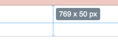
Now.. how do we know to choose 50 pixels? I have installed a chrome extension called 'Dimensions’, which is handy to show the size of different parts of web apps.
Using this on the original Wordle page shows us that the height is 50 pixels.
just ignore the width for now.. that varies depending on the screen you are viewing the site on, which is what we want.
OK, with those settings you now will have a white header group which looks good at any screen size down to 320px.
Header Content
Inside the header we have what looks like 3 groups.. a left and right one which have some UI controls, and central text logo. Let’s add these 3 groups now and set them up to be spaced correctly.
Tip: when just laying out the basic structure of an app, it’s handy to start with basic blocks of colour, and then fill in the details later. For this I have created a basic ‘blue’ group, which is just a copy of the ‘Group Wordle’ group listed above, but with a blue-ish colour setting and opacity of 50.
Choose any colour you you like :) I’ve named mine Group Blue.
Add 3 groups to the header, and set them up like this:
Name: Group Left
Name: Group Logo
Name: Group Right
Tip. If you find your groups end up in the wrong order for some reason, bubble now has these handy rearrangement buttons to change the order.
All we need to do for now in the header is to add text element to the Group Logo, which will contain our WorldeClone text.
Previewing gives us this:
so far so good.
Now it’s time to add some more rows for the other content
More Rows
We have one row so far, which is the header. I think 2 more rows would be a good idea, to manage the layout of the Guesses, and the Keyboard.
Group Middle
Group Bottom
Now we have the basic structure of the layout, we can move on to filling up more detail. Image below with initial colour to show the groups.
Note, after I’m happy with the general layout of groups, I reset the group styles to be ‘Default Group’.
Guesses Section
The main focus of the app is the central area where our guesses go. It behaves like a series of input boxes, controlled by either your physical keyboard input, or the onscreen keyboard. It’s therefore tempting to think that adding ‘Input’ items from the ‘Input forms’ section is the right thing to do. However, clicking directly in these boxes on the Wordle app doesn’t show a cursor, and doesn’t allow you to type. The function of these boxes is really to just display activity going on elsewhere in the app (the keyboard).. so choosing the Text item from the ‘Visual elements’ part of the menu seems a better choice.
There are 6 rows, representing the 6 chances we have. Each row is a self contained logical entity, so I’ll want to add 6 groups, one for each row. Each row will contain 5 Text inputs, representing the 5 letters of the word. And the whole thing I’ll place into a Group, to control how it is laid out on the screen.
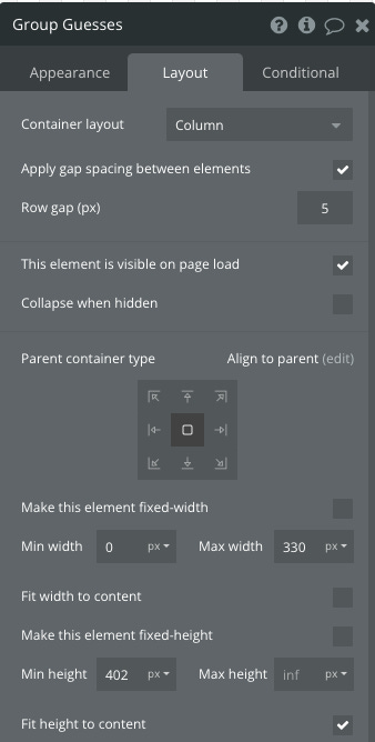
The group to contain the rows I’ve set up like this:
You’ll notice there is a setting we have enabled called ‘Row gap (px)’. Setting this at 5 will create a gap between of the rows [that we’ll add soon], which is handy as it saves us setting padding or margin on each individual row.
Guesses Rows
Within this Group Guesses, I want 6 rows, each representing one of my 6 chances.
Add a new group into this Group Guesses, and name it ‘Group Guess Row 1’.
Structure the layout like this:
And within this row, we want 5 ‘Text’ objects, with this configuration
I’ve found it's easier to tweak the settings of one item, then copy paste it. Make sure that each Text box gets pasted into the ‘Group Guess Row 1’ row. After you have 5 of them, rename each so be some that makes sense.. i.e
And now that we have 1 row just how we want it, copy and paste 5 more into Group Guesses, do some row renaming, so that we now have our 6 rows.
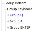
The structure is now like this..
and it continues on, to encompass the 6 rows of 5 guesses.
This seems like a bunch of work, and it is, but I suspect we’ll get that time back later when we are adding states, logic, workflows, in that we can individually access values to each item in the grid, plus construct a value for a row by concatenating values across a row. This could perhaps have been done with a reusable, but I expect there is some complexity in the rules coming up that might make that approach more complicated in the end.
Tip: for more info about reusables read this forum post https://forum.bubble.io/t/a-guide-to-advanced-use-of-reusables/63884
Keyboard Section
ok, now on to the onscreen keyboard. I added a group called Group Keyboard, to the Group Bottom
Within this new group, we need 3 rows which we’ll add the buttons into:
For the top row, I added a text item for each of the 10 letters on that row
with each letter having configuration like this:
and for the middle row, I added a couple of empty spacer groups, to handle the layout better with the smaller number of letters in that row
This spacing is controlled by the ‘space between’ setting of the row.
The overall result is pretty close to the original, and it shrinks down nicely on smaller screen sizes
The only thing left for the Layout stage, is to add the icons to the header.
Header Icons
There are two groups of icons to add.
Left:
Right:
I installed the Ionic Elements plugin to get access to more options.
I chose the ion-android-menu icon for the bars:
the built in ‘Icon fa fa-question-circl’ for the question mark:
and the ion-android-settings icon for the cog:
The other one I couldn’t easily find an existing icon in either the ionic set or the built in Bubble Icon set.
So.. what to do. If you checkout this tweet you’ll see that we can use the same svg ‘instructions’ that the original Worlde used:


So, here is the config I used for it by adding an HTML element:
and I also used this technique for the ‘backspace’ key in the on screen keyboard:
and to assist with the standard keyboard styling, I added the HTML element for the backspace key to a Group, and added the styling to the group.
UI Layout Done!
So.. we now have a good UI layout structure which is very similar indeed to the original Wordle, and apart from a little svg tweaks, no code was required.
This article has got pretty long, so we’ll leave it there. The next article or two will address how to make the app come alive, with things like States, Workflows and Transitions.
Thanks for reading along, and I’ll see you in the next one.
ps, paid members get to ask questions in the comments plus get access to all paywalled articles, so head along there if keen. I’m currently running a 20% DISCOUNT :
...Marty


